Showing posts with label water soluble pastels. Show all posts

Tuesday, January 19, 2021

Craft Napa - Surprise Printing

Four years ago, Sue went to Craft Napa with 2 friends for 3 days of fiber art classes.  What a fun time!  Things haven't worked out to return to this California retreat, but this year because of the pandemic, it moved online like so many other events.  Being virtual, anyone could participate from the comfort of home.  So Sue signed up for one class.  There were others she was interested in, but as sometimes happens, several were on the same day so choices had to be made.  The class she took was called Surprise Printing taught by Margarita Korioth.  The technique involved using Caran d'Ache water soluble wax pastel crayons with transparent extender and silk screens to created printed blocks.  The "surprise" is seeing what your blocks look like after washing off the excess crayon. 


These were some of our supplies.  The teacher's kit included the 2 silk screens (made with heat transfer vinyl) and selected colors of Caran d'Ache water soluble wax pastels. (Sue purchased this larger set.) We also needed some squares and rectangles of white Kona cotton and transparent extender - ProChem is a recommended brand. 

To create blocks, we first colored the cotton squares with the wax pastel crayons.  Then we used the silk screen to overprint with the transparent extender.  These were then set aside to dry.  We also made a repeat pattern with the other screen on a rectangular piece of cotton.  The third component created was a wide strip that could be cut into narrower strips for sashing and/or binding.  This piece was done by separating it into segments with painter's tape and coloring in between.  The transparent extender was brushed over top.  All were allowed to dry before heat setting and then soaking in water (about 10 minutes) to remove the excess crayon.  The extra color doesn't come out completely, but enough to fade into the background and allow the printed design to stand out.


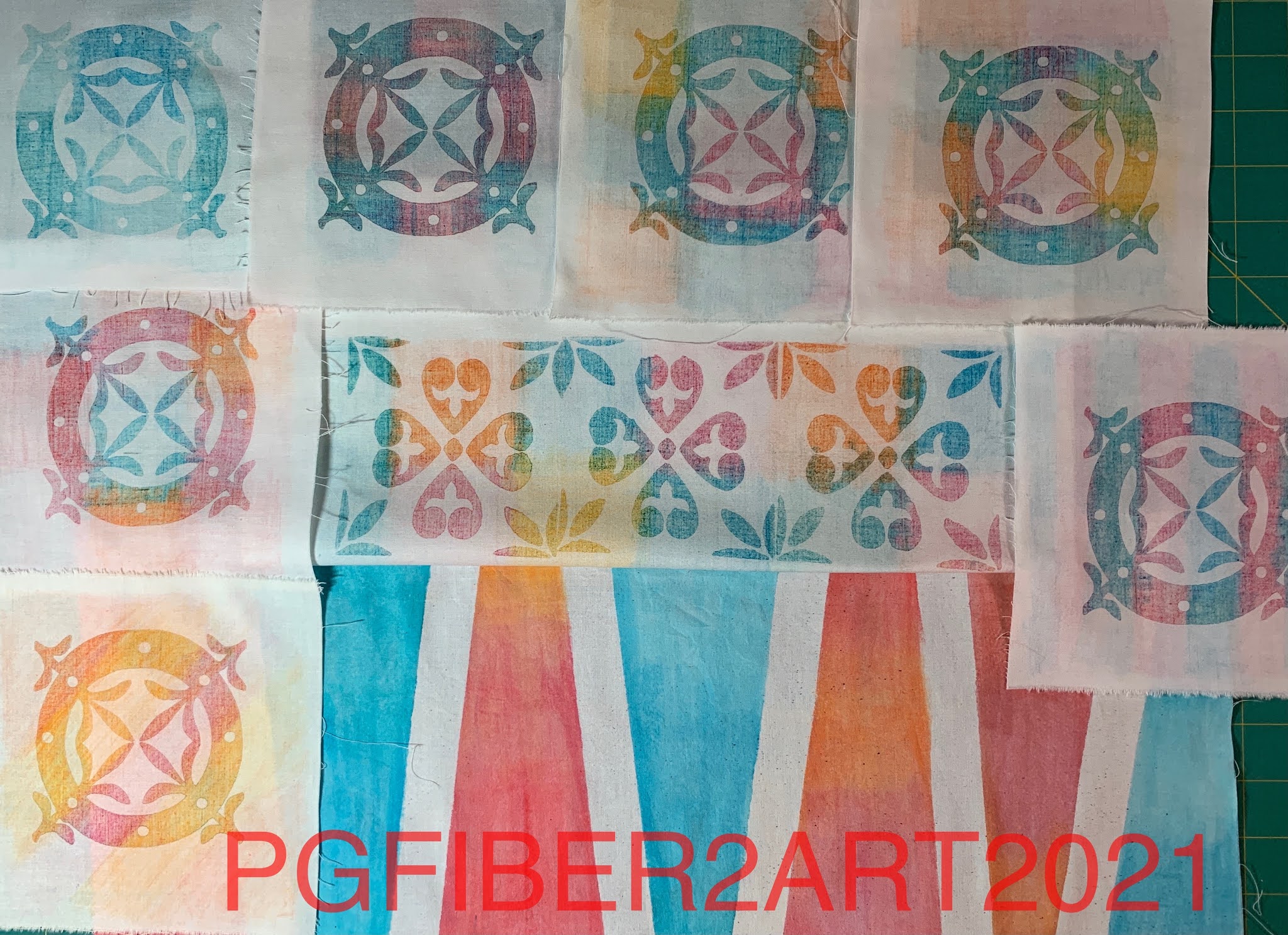
The pieces above were the first ones completed.  After some additional instruction, there was time to make some more!

These additional blocks and repeat section are drying before heat setting and rinsing.


Above are the finished second group of pieces. Now what to do with them?  Margarita used hers to make both a quilt and a pillow. Check out this link to see more of her work.  The blocks can be assembled randomly in rows, with or without sashing, bordered if desired.  Use your imagination!  This was a fun process and we're excited to see how it can be adapted for use with Thermofax screens. Experiments to come!

Wednesday, August 19, 2020

Quilt Camp Week 6 - Multiple Colors

The techniques we've shown so far for using Thermofax screens have mostly been one color techniques.  You may be wondering - how do they print t-shirts and other products with multiple colors?  While the commercial process is a bit different from Thermofax screens, there are ways to use multiple colors with screens, and that is our topic for this 6th week of quilt camp. We'll look at ways of blending colors and designs that use more than one screen.  So let's get started.

One way to use multiple colors in a design is to create images with multiple parts - for example, an image that has both "fill" and outline, or one that has both a positive and negative component as the following pictures will show.

This is a 2 part screen for a black-eyed Susan - one screen for the petals and one screen for the center and outline. Print the petals first and allow to dry, so the outline will print on top. Sue's print is above, Elizabeth's is below.
Elizabeth is printing on a background created with breakdown printing, another printing process we'll talk about in a later post.  Her tips are to print off the edge, and don't worry about getting a perfect match when you do a 2-screen print like this.

Here's another flower, this time there's a rectangular outline which creates the negative image (empty space) and then a second screen for the flower itself (positive image).
Above, the positive image is printed over the negative.
These are Sue's finished prints. Hmm...how did those pink flowers end up yellow?  Short answer, she didn't like the original color combination so did another! The yellow center on the right print was added with a paint brush.

You can also use multiple colors on the same screen that will blend as you print, and change slightly with every succeeding print.
Here Sue used yellow and red for some leaf prints.  You'll get the most distinction between colors on the first print.  After that, they will blend as you print to form new colors. So carefully consider your color choices.
Can you tell which is the first print from the paint photo above?

Elizabeth printed a zebra with two colors - gold from Artistic Artifacts at the top and navy blue from Pro-Chem at the bottom.  Her background here is also a breakdown print.

Another way of incorporating multiple colors in a print is by using water soluble crayons like those shown below - Derwent Inktense color blocks and Reeves Water Soluble Wax Pastels.
For this process, start with the screen placed on top of parchment paper (freezer paper would work too).  Apply the color to the screen just by coloring over it. Then place your screen on the fabric you wish to print on.
Matte medium is the product needed to make the print.  Place a line of the medium across the top of the screen and squeegee across it the same as you would with paint.  The medium dissolves the color and prints it through the screen onto the fabric.
The print on the left is done with the Inktense blocks, the fish on the right are done with the Reeves water soluble pastels.  The use of the matte medium adds a little bit of stiffness to these prints, but heat setting with the iron removes most of it.  This method gives you more control over the color placement.  The colors will blend a bit where they overlap, but not as much as using multiple paint colors.

Have fun trying these methods and products to add multiple colors to your prints.  If you see screens you like in this series of posts, look for them in our Etsy shop.  If you don't find them there, feel free to send us an email at pgfiber2art@gmail.com and let us know what you are interested in; we only have about half of our screen catalog in the Etsy shop, but are happy to add upon request.

Wednesday, May 27, 2020

Postcard Swap

Sue's fabric postcard swap group is still carrying on after about 15 years, swapping cards twice a year.  We are still at 5 members, though one of our originals bowed out after the last exchange. However we picked up a new member so we break even.  Our spring swap is due by the end of June; 3 of us have sent our cards, while 2 are still in the works.  Sue sent hers out last week so it's safe to reveal here on the blog.

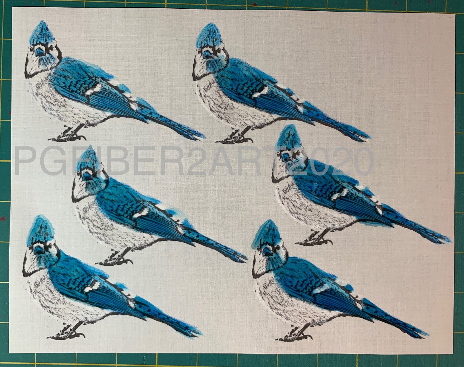
The theme for this go-round is "corvids".  Corvids, also known as the crow family, is a family of birds that includes crows, ravens, rooks, jackdaws, jays, magpies, treepies, choughs and nutcrackers.  Before doing a little research, Sue only knew of crows being in this group, so when she saw the other birds included, she chose to feature the blue jay. Since those in her back yard didn't cooperate for a photograph, she found one licensed to use on Wikimedia Commons taken by Jocelyn Anderson. (https://commons.wikimedia.org/wiki/File:Blue_Jay_(185317371).jpeg ) Sue's first step was to alter the image in Photoshop to remove the background and apply a filter as she does when creating screen images. Then the image was printed in black and white on inkjet fabric sheets.  (Sue uses EQ Printables by The Electric Quilt Company)
The images were then colored with water soluble wax pastels made by Reeves, and cut out.  After applying the color, brushing over it with water softens and blends the color.

Finding a background for the card was the next step.  Sue settled on a piece of ice-dyed fabric that was mainly green but with bits of other colors to give the effect of a tree or greenery. The base of the postcard is a stiff fusible like Peltex that is fusible on both sides, so the fronts and backs of the cards can be fused in place before stitching.
Then a branch was cut out of brown hand-dyed fabric and fused on top of the background.
Some machine stitching added texture to the branch. Then the blue jays were fused on top and stitched around the edges.  The fusible product used is Mistyfuse, a very thin fusible.
After adding the backing, the edges are satin stitched.  Here's a close up.
The other 2 cards received so far both feature crows.
This interpretation of the theme is by Grace Ng.  One member pointed out that 3 crows together means "health".  How appropriate!
Cathy Tyler created her version of Mourdour, a talking raven who lives in North Yorkshire, England.

Can't wait to see the next two cards!

Saturday, November 22, 2014

Published!!


 Whew!  I'm very excited to announce that I (Sue) have been published for the first time!  A small 8x10 quilt I made for a Quilting Arts Reader's Challenge was selected for publication in the Dec-Jan issue, which is just beginning to arrive in shops and subscribers homes.  I believe the newsstand release date is Dec. 2.  The theme of the challenge was "Changing Seasons" but not just the obvious seasons of the year - also seasons of your life; transitions, transformations, changes that we all go through.  My interpretation was the life change of retirement, against a backdrop of riding off on a motorcycle trip the day after I left work for the last time. 

I started with this photo and used Photoshop Elements to turn it into a black and white image, the same process I use to make an image for a thermofax screen.  Instead of making a screen however, I printed the black & white image onto an inkjet fabric sheet.

Then I used water soluble pastel crayons to  color the image.  I have both Reeves and Derwent colors, but mostly used the Reeves.  

After coloring, I used the Fantastix brushes in the photo with water to blend the colors.  Then I made a thermofax screen of the word "retired" and printed it.

Next was quilting; a variegated thread was used for the trees and leaves, and red around the word "retired".  The binding is fused, a separate piece on each side and then satin stitched through all layers on the inside edge.  Here's the final piece and a close-up.

There's lots of stitching but it really blends in. If you click the picture to enlarge it you might be able to see it better.