Wednesday, August 26, 2020

Quilt Camp Week 7 - Printing with Dye & Other Materials

This week we are combining printing with thickened dye along with printing on things other than cotton fabric.  What is thickened dye?  It is dye added to a clear print paste made with sodium alginate and water.  Exactly as the name implies, it thickens the dye to a consistency that works for printing.  Why would you want to print with dye instead of paint?  Dye bonds with the fibers and gives fabric a softer hand than paint.  It can also be discharged as we saw a few weeks ago.  Paint sits on the fabric surface, so adds a little bit of stiffness, depending on the brand of paint.

The ingredients for clear print paste include water, urea, and sodium alginate. Both urea and sodium alginate (thick SH), as well as dyes, are available at Pro Chemical and Dye.   Urea helps with the solubility of dyes.  Clear print paste will last for weeks in a cool environment.  For this example, Sue used 1 c hot water, 2 T urea, and 1 T sodium alginate.  Stir rapidly until as smooth as possible (it will be lumpy at first), then allow it to stand for at least 1 hour.  After standing it will become smoother.  For the actual printing, 2 tsp of dye were added to 1/4 cup of the clear paste.  Another ingredient needed for the dye to bond with the fabric is soda ash.  You can either pre-soak your fabric in a soda ash solution, or add it to the print paste.  For this amount of paste, a 1/4 tsp of soda ash was dissolved in hot water and then added to the print paste. This mixture needs to be used within 4 hours or the soda ash loses its effectiveness and the dye will not fully bond with the fibers.  The dye Sue used for her print paste was teal, though in the photos that follow it almost looks black.

Here are some of the prints she made.  The first 2 were printed over geli plate printed backgrounds.
This is our chain link screen.
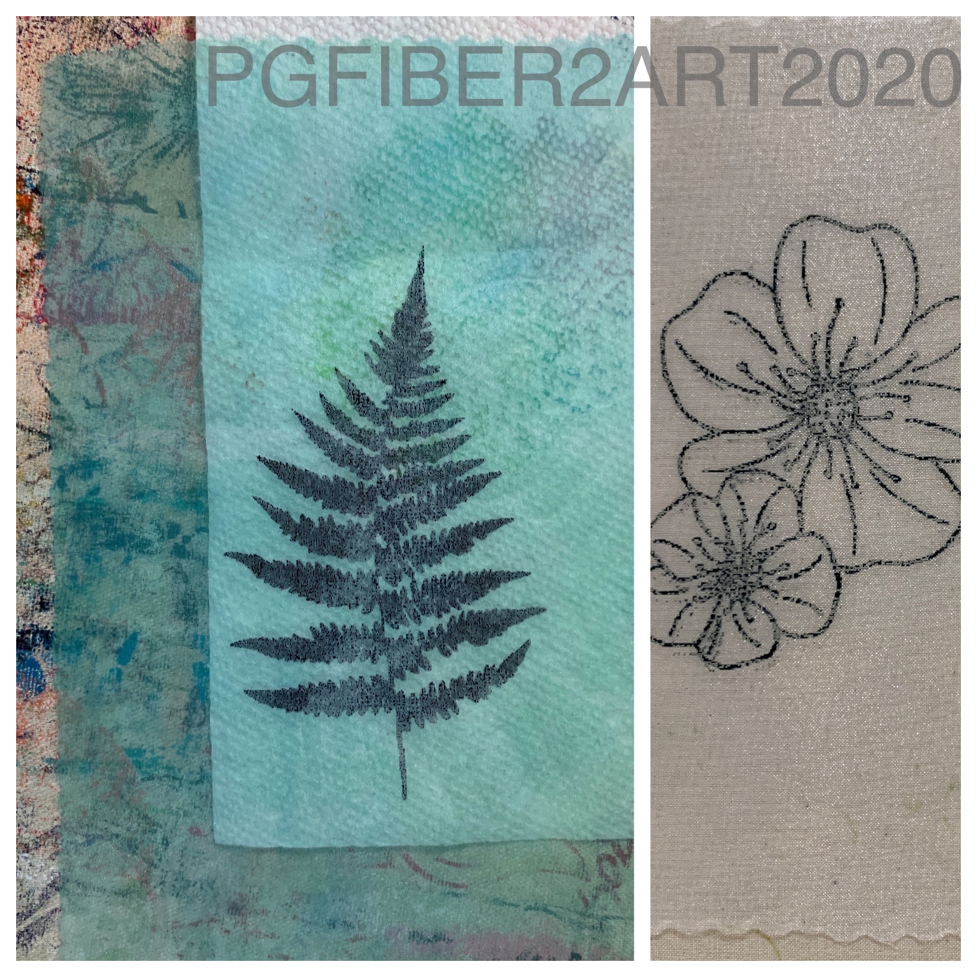
This is the Merrymount wildflower.  As with other products we've used, the printing process is the same as with paint.
These 2 prints are on a background made with a process called breakdown printing.  We'll have another post on that process later.
More prints on pieces of cotton that were first painted with diluted textile paint. Now for some other materials.
 
We enjoy printing on Color Catchers.  If you're not familiar with them, Color Catchers are a product you can buy in the laundry section of your local store.   You put them in with laundry to absorb excess dyes; in our case, we use them when washing hand dyed fabric and end up with some pretty colors.  Why print on these?  Well, they are a non-woven product similar to interfacing and do not ravel.  That makes them good for raw edge appliques and use in multi media work, journaling, etc.
Another fabric you can print on is organza; this piece was first painted along with the others above. A plain white piece is shown on the right.  This would be good for layering.
And finally, another product that can be painted and printed on is Lutrador.  This is another non-woven product (polyester) that can be used in art quilts or mixed media work.  You can see the texture in the photo on the right.

Don't forget you can print on paper too, and silk fabric is another choice. It is especially good for silk to keep the soft hand and drape of the fabric (think silk scarves).  What will you print with thickened dyes?  Finally, a bit of advice from Elizabeth: don't let your printed pieces and dye paste sit outside and then leave.  If it rains like it did for her, you may end up with a gooey mess!

Wednesday, August 19, 2020

Quilt Camp Week 6 - Multiple Colors

The techniques we've shown so far for using Thermofax screens have mostly been one color techniques.  You may be wondering - how do they print t-shirts and other products with multiple colors?  While the commercial process is a bit different from Thermofax screens, there are ways to use multiple colors with screens, and that is our topic for this 6th week of quilt camp. We'll look at ways of blending colors and designs that use more than one screen.  So let's get started.

One way to use multiple colors in a design is to create images with multiple parts - for example, an image that has both "fill" and outline, or one that has both a positive and negative component as the following pictures will show.

This is a 2 part screen for a black-eyed Susan - one screen for the petals and one screen for the center and outline. Print the petals first and allow to dry, so the outline will print on top. Sue's print is above, Elizabeth's is below.
Elizabeth is printing on a background created with breakdown printing, another printing process we'll talk about in a later post.  Her tips are to print off the edge, and don't worry about getting a perfect match when you do a 2-screen print like this.

Here's another flower, this time there's a rectangular outline which creates the negative image (empty space) and then a second screen for the flower itself (positive image).
Above, the positive image is printed over the negative.
These are Sue's finished prints. Hmm...how did those pink flowers end up yellow?  Short answer, she didn't like the original color combination so did another! The yellow center on the right print was added with a paint brush.

You can also use multiple colors on the same screen that will blend as you print, and change slightly with every succeeding print.
Here Sue used yellow and red for some leaf prints.  You'll get the most distinction between colors on the first print.  After that, they will blend as you print to form new colors. So carefully consider your color choices.
Can you tell which is the first print from the paint photo above?

Elizabeth printed a zebra with two colors - gold from Artistic Artifacts at the top and navy blue from Pro-Chem at the bottom.  Her background here is also a breakdown print.

Another way of incorporating multiple colors in a print is by using water soluble crayons like those shown below - Derwent Inktense color blocks and Reeves Water Soluble Wax Pastels.
For this process, start with the screen placed on top of parchment paper (freezer paper would work too).  Apply the color to the screen just by coloring over it. Then place your screen on the fabric you wish to print on.
Matte medium is the product needed to make the print.  Place a line of the medium across the top of the screen and squeegee across it the same as you would with paint.  The medium dissolves the color and prints it through the screen onto the fabric.
The print on the left is done with the Inktense blocks, the fish on the right are done with the Reeves water soluble pastels.  The use of the matte medium adds a little bit of stiffness to these prints, but heat setting with the iron removes most of it.  This method gives you more control over the color placement.  The colors will blend a bit where they overlap, but not as much as using multiple paint colors.

Have fun trying these methods and products to add multiple colors to your prints.  If you see screens you like in this series of posts, look for them in our Etsy shop.  If you don't find them there, feel free to send us an email at pgfiber2art@gmail.com and let us know what you are interested in; we only have about half of our screen catalog in the Etsy shop, but are happy to add upon request.

Wednesday, August 12, 2020

Quilt Camp Week 5 - Take It Away!

We all (or most of us!) love color, don't we?  But sometimes we want to take color away - to create interest or contrast or the illusion of shadows.  Or just because it's a fun technique.  The process of doing this is called DISCHARGE, and it can be done with various products.  We have selected 3 products to illustrate using this process with Thermofax screens. 

But wait - there are more than 3 products in that picture!  Let me explain.  DeColourant by Jacquard is a product formulated for discharge and can be used right out of the container.  It's consistency is perfect for using with Thermofax screens.  It involves a 2-step process - applying the product and allowing it to dry (it can still be damp), then applying heat and steam with an iron to activate the color removal.  the longer you steam it, the more color comes out.  You can stop at any point when you are happy with the color change.  The one drawback to this product is the odor - it does need to be used in a well-ventilated space.

Bleach gel also works well to discharge, however this product is rather thin for use with a screen.  To solve that problem, it can be thickened with sodium alginate which you see in the packet on the left.  This is the same product used to make thickened dye, so if you do any dye printing, you may have some on hand. Just sprinkle a bit into the gel and stir to thicken; add a little bit at a time until you have the right consistency.  Because this is a bleach product, you need to drop your fabric in an anti-chlor solution to stop the color change. (That is the product on the right in the back, from ProChem.)  If you don't stop the action of the bleach, it will continue to eat away at the fibers and may result in holes.

The 3rd product is a bleach pen.  If, instead of discharging through screens, you want to draw patterns on fabric, this is a good choice. But you could also use it with screens if you don't have any other products; just use it to apply the bleach to the screen and then spread it with a squeegee, or be selective about the parts of the screen you use it on.  The pen has a "fine" tip and a brush tip.  The word "fine" is in quotes because "fine" is relative.  Don't expect thin lines.  As with the bleach gel, this product needs to be neutralized with the anti-chlor.

Though we didn't use it in this activity, Cascade dishwasher detergent is another product that contains bleach that can be used for discharge.  Sources for products are linked above.  The bleach gel and pen are from the local grocery store.

Now that you have some background on products, let's see what results they produce.  First, apply the product through the Thermofax screen just the same as you do for paint and other products.
This gear screen was used with the bleach gel.
These are 2 batiks that were discharged.  The fun part of this technique is that you never know exactly what you're going to get.  Some fabric dyes discharge better than others.  Some turn unexpected colors. Blacks from different manufacturers may give you totally different results.  Different products may give different results - you'll see that in the photo below.
This piece shows the bleach gel gear discharge at the top.  The bottom is a boiler wheel screen done with deColourant.  What different color results!  We purposely kept these prints together so you could see they're on the same piece of fabric.  Again, you never know what results you will get.
Here are 2 more examples of the boiler wheel on batiks.  Noticeably the red provides a much sharper print. After those 2 products it was time to play with the bleach pen.  Each of the following pictures shows the pen applied on the left, and the rinsed, dry print on the right. (Note: these are doodle designs rather than Thermofax screens.)
Unlike the deColourant, the bleach products will effect the change within minutes.  Just keep your eye on it and when you are satisfied with the color change, drop it in the anti-chlor solution.
The circles were done with the fine tip of the bleach pen, the lines were done with the brush tip.
The x's above and spirals below were to show how colors besides black discharge. Again, it depends a lot on the dye used in the fabric.
So, what will you discharge?  If you try this technique, we'd love to see pictures of your results.  Share in the comments here or on our Facebook page.  Just be sure to work in a well - ventilated area, especially when ironing the discharge.  Sue found that working next to a screen door with a fan blowing out helped dispel the aroma. And be sure to have some anti-chlor on hand to stop the bleach action of the other products.  That being said, have fun!

One final picture, you may be wondering how to apply this technique to your art quilts, so here's an example.

The leaves here were discharged with deColourant after the background was sewn together.

Wednesday, August 5, 2020

Quilt Camp 2020 Week 4 - Add Some Shine

Who doesn't like a little sparkle?  Virtual quilt camp continues this week with ways to add some shine to your work with Thermofax screens.  We take a look at metallic paint, foil and gold leaf.  Here we go!

The easiest of the 3 is metallic paint.  The only thing new to learn about metallic paint is that because it has mica in it, it can clog your screen quicker than non-metallic paints.  That just means you might need to wash it sooner.
Elizabeth decided to overprint one of her color magnet masks with gold metallic paint from Artistic Artifacts.
Now she's ready with several masks for those necessary trips away from the house.

Another product that can add some shimmer is decorative foil.  It comes in assorted and variegated colors and is applied with glue and heat.
The glue is screen printed onto your fabric just like paint and allowed to partially dry - it should still be tacky when you apply the foil.  The foil is placed color side up over the glue, and then ironed with dry heat.  Using the edge of the iron helps create a firmer bond. Carefully peel off the foil.
This piece is a hand-dyed handkerchief that came out pretty dark.  The ginkgo leaves were printed with a discharge product but didn't have a lot of definition, so were a good candidate for over-printing.  Several were done with foil and others were printed with metallic paint.
It's hard to get a good picture of the shine, but you can see it in this one.

Sue decided to do some foil that would be more easily seen on another handkerchief, this one with discharged butterflies.  The thinness of the fabric seemed to allow the discharge product to spread more than usual. In this collage you see the original and 3 applications of foil -  yellow-orange, purple, and red.
The remaining butterflies were over-printed with metallic paint.
A third way to add shine is to use gold leaf.  This method is a little more costly, so you might want to save it for those really special pieces.  These sheets are made by Speedball and came from Jerry's Artarama.  You also need a product called high gloss medium to apply it to the fabric.
As with the foil and glue, the high gloss medium is the adhesive that holds the gold leaf to the fabric. It is applied though the screen just like the other products.
 On this handkerchief several leaves were chosen to add the gold leaf to.  After the medium dries, lay the gold leaf over top and place parchment paper on top of that.  Then iron to adhere the gold leaf to the fabric. The bottom right picture above shows the gold after it's applied.  The final step is to brush off the extra gold.
Since the leaves (and most designs) are not solid shapes, use a soft brush to brush away the gold that is not adhered to the fabric.  In this final photo you can see the gold leaves as well others that were over-printed with metallic paint.
 Here are a few of the metallic paints that Sue used in completing these samples. Note pearlescent = metallic.  The Speedball is not labeled as metallic, but you can see the shimmer in the paint through the container.  The Artistic Artifacts paint is bronze metallic.  What are your favorite ways to add shine to your projects?