Showing posts with label collage. Show all posts

Friday, September 17, 2021

Cyanotype experiments on coffee filters

For several years at Quilt Camps, Sue and Elizabeth have experimented with Cyanotype on fabric.  The availability of ferns and other interesting botanicals in New Hampshire make them fun to do.  Of course, we also have made some at our homes in Virginia and Elizabeth has done some in the hot humid weather in Mississippi. Heat and humidity certainly affect the results as does the directness of the sun on any given day and if the sky is cloudy.  So many variables and it is the serendipity that makes it interesting.

Cyanotype is actually an alternative photography process developed in 1842 by English Astronomer, John Herschel who was interested in ways to copy his manuscripts and notes.  It was Anna Atkins who in 1843 used the process to catalog botanical specimens.  

In preparation for a paper collage workshop in a few weeks, Elizabeth has been experimenting with some cyanotypes while still in New Hampshire where it certainly isn't hot or humid and the sun seems to get weaker every day.  Even so, experimenting is fun and helps to build up a supply of papers from which to choose when the workshop begins.

Round coffee filters are an easy way to experiment.  They are quick to dry after applying the chemicals to the paper and you can treat many of them at once.

Following some instruction from the dharma website about Jacquard products (Jacquard is the company that makes the chemicals needed for cyanotype) she started bleaching and toning some of the exposed samples to see what the results might be.

Only a Soda Ash rinse for this one, you can see how it really bleaches out the cyanotype chemicals.


Here are some rinsed with Borax then with Soda Ash water and a final rinse in plain water,  Here she got a bonus print.  Coffee filters are very thin and she hadn't noticed that two were stuck together until they separated during the final rinse.   The lower filter was the one on the bottom.


This one was rinsed with Borax followed by Soda Ash and then a Hydrogen Peroxide rinse.  The hydrogen peroxide brings out more of the blue as it speeds up the development process.


This piece was rinsed in Soda Ash which bleached it out and then followed by Borax.  The brown streak in the middle is explained below.


These were swished in Borax, then a mix of Hydrogen Peroxide and water, followed by a dip in soda ash and another rinse in Hydrogen Peroxide and water.  Her scientific methods aren't quite as firm as they should be as measuring was loosey goosey, but approximately 1 part Borax to two parts water, 1/4 cup of soda ash to 1 gallon of water, and a glugg of hydrogen peroxide in a cat litter pan full of water.  Surely, on different days with different amounts of chemicals, different temperatures, different types of treated papers, results will vary a lot.


The brown streaks on the prints above came from hanging them over a drying rack.  Previously a tee-shirt which had been soaked in soda ash had been hanging on the rack and the residual soda ash bleached out the streaks in these two pieces.

There are other toners and bleach you can also use.  Let us know if you have done any experimentation.

Wednesday, June 21, 2017

Collage Journal Cover

We started out Libby's Paint & Stitch class by painting papers, as shown in yesterday's post.  Then Libby demonstrated how she uses the painted papers to create a collage on the front of a journal cover.  (The one below is a sample collage, not an actual journal cover.  Wish I had taken more pictures of her journals!)
The papers are applied with matte medium and allowed to dry.  Then free motion stitching is added with black thread to give definition and add detail.
 A layer of felt underneath the canvas fabric adds stability and depth.
Libby adds thread sketching on the back as well as inside cover and signature on the inside back.  The top and bottom edges are "scribble" stitched to hold the layers together.
Above is Sue's collage before stitching.
And after stitching.  A standard composition book fits inside.  I wish I had taken more pictures of the process, but I was having so much fun creating, I didn't think about it!  I was also surprised how quickly this project came together.  Totally freeing, embracing imperfection!  Thanks, Libby!

Tuesday, April 7, 2015

Along the Spice Road to China - Moving Along


Because I wanted to incorporate the use of thermofax screens in the design, I took some photographs to burn into screens.


Several were peppercorns spread on a sheet of paper and one was even those hot spicy varieties of pepper.  Ultimately I did not use those screens.  Instead I picked some images from copyright free graphics and clip art to make screens and also used a stencil of Chinese characters (apparently about the Yellow River).

I knew that I wanted to frame my photo in some way and settled on a collage approach using a mix of commercial and hand dyed cottons, some upholstery samples, and pieces from a hand dyed silk scarf which I cut randomly into squares and rectangles. 
I wanted this background collage to be textured and then printed so decided that I would write out several stories with permanent marker across the fabric to give the base a texture and to record the hidden stories on the quilt. 
I started writing three stories onto larger parts of the fabric but as the collage started to come together I switched to writing on the precut pieces as a time saving measure since by now the deadline was less than 30 days away.  I used several colors of permanent marker and wrote one story about our family trip to China in 2007, one story of my “pretend” traveling spice selling family from many centuries in the past, and then one about the basic research I did on black pepper and its use in China.
These pieces were backed with MistyFuse, arranged and adhered to a batting of cotton/bamboo.  Then they were free motion zigzag stitched around all sides and through the batting.  Meanwhile I was also working on a way to transfer my photo image.  While it looked fairly clear on the computer screen there was pollution hanging in the air that day and everything in the distance seemed hazy.
I tried ironing freezer paper to a good quality muslin and putting it through our printer and was not happy with the results.  Next, I tried a product that gave me a plastic looking image that included splotchy areas.  That was a big “no” also.  After going to the Quilter’s Unlimited quilt show just a few short weeks before the deadline, I found the product that produced the best results from one of the vendors.  
I printed the photo in four sections to fit the space I had allocated for it on the base fabric.  This was also fused and the horizontal and vertical edges that joined the four pieces were stitched together with a narrow zigzag.  On the back went a layer of felt as the backing.
Above, I am auditioning fabrics and determining the best placement for the window element of the collage.

Thursday, March 5, 2015

Passion Play - Screen Printing

Sue recently finished a 12 inch square quilt for an art bee challenge. The theme was "What is your passion?  She decided to focus on surface design, particularly screen printing, as her passion, and called it "Passion Play". All the pieces were pulled from her stash, and only one was a commercial fabric.
We shared this on Facebook, and asked the question - which of these pieces is the commercial fabric?  So far there are 2 incorrect guesses. So we thought it would be interesting to share the various pieces in the collage, and the steps they went through to arrive at the finished product.

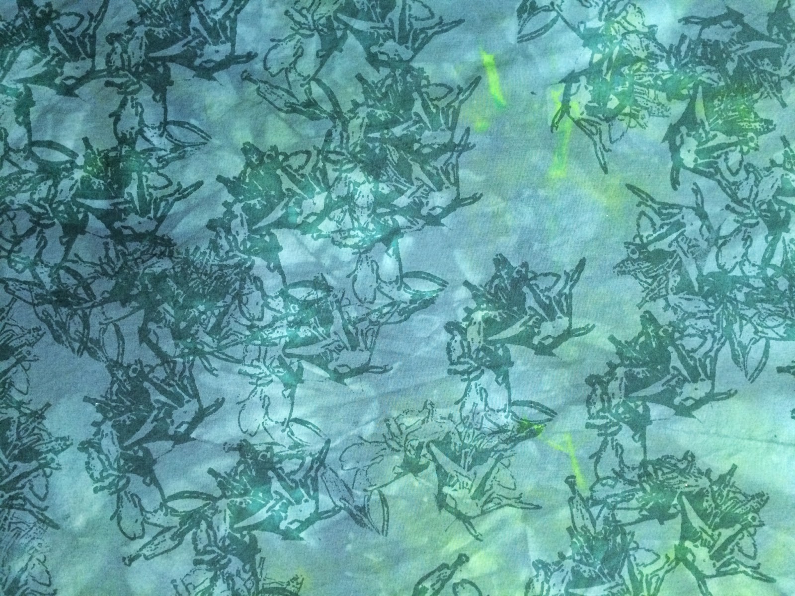
One guess was the piece on the right with the text on it. This piece was hand-dyed and printed.  It was first dyed green, but wasn't very inspiring.  So last summer it got new life  by being over-dyed with a teal color and color magnet.  You can still see some of the original green in the photo below.  The pattern was created by screen printing with a product called Color Magnet by Jacquard; after printing, it is allowed to dry.  During dyeing, more dye is attracted to the color magnet creating a tone-on-tone effect. 
A strip of this was added to the collage, as it is in the picture above.  Sue decided it was too dark for the other pieces in the collage, so she decided to alter it by screen printing with a discharge product called DeColourant which takes color out.  The color a fabric discharges to can be a surprise, because it depends on what colors are in the dye.  She did a test on a scrap of the fabric and, satisfied with the color results, went ahead with discharging the piece in the collage.
This is the thermofax screen she used for the text - a definition of the word "art", which is available in the Etsy shop here.  Using the discharge to change the color toned it down enough to work better with the other fabrics in the collage.
And there you have the process for how this piece of fabric came to be.