Wednesday, July 29, 2020

Quilt Camp 2020 Week 3 - Color Magnet

Do you dye your own fabric?  Have you tried Color Magnet?  Color Magnet is a dye attractant.  If you make marks on fabric with this product and allow it to dry before dyeing, it will attract more dye to those areas producing a two-tone effect.  In week 3 of our virtual quilt camp we used Thermofax screens with Color Magnet.
The first step was to soak the fabric to be used in a soda ash solution and then allow it to dry.  The soda ash bonds the dye to the fabric, so you must either pre-soak the fabric, or add the soda ash to the dye.  A 20 minute soak is all that is needed.  After the fabric is dry, print your image onto the fabric. You can see that the color magnet is yellow.  It is also thinner than the paints we typically use.  A little bit goes a long way!
For her sample Sue used a screen of Queen Anne's lace and azure blue dye. She used a low water immersion method and let the fabric batch for 24 hours before rinsing and washing. 
Enlarge the photo above to better see the results.  The azure blue turned out darker than anticipated so the color magnet prints are less obvious in this small photo.

Elizabeth's project was a cotton face mask which she printed with a dragonfly screen.
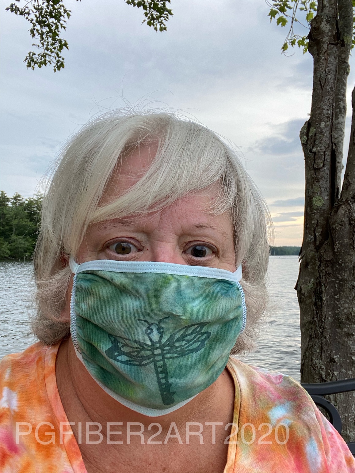
After allowing it to dry she dyed it green using an ice dye technique.  (See our tutorial on ice dyeing for more info.)  Here you can clearly see the effect of the color magnet.  Quite the appropriate face mask for life on the lake in New Hampshire.

Sue decided to try a few more pieces, this time she used the ice dye technique with coral dye.
The results are below. One piece was directly under the ice (on the right), the other was in the pan below to catch the drips (on the left).
The piece on the left has a crackle pattern, the one on the right has a rectangle pattern. And below are a few pieces from a previous dyeing session. That coral seems to be a favorite color!
You could also use color magnet with stencils to create a pattern before dyeing,  It is available in a pen form as well, so could be used for writing words or drawing designs.  If you enjoy dyeing fabric, this is a fun product to play with to create pattern in fabric. 

Wednesday, July 22, 2020

Quilt Camp 2020 Week 2 - Resists

What's a resist?  A resist is something that blocks the absorption of paint or dye.  For this week's exercise, we worked with 2 resists.  One is a water-based resist made by Jacquard.  The other is white acrylic paint; Sue used Artistic Artifacts fluid textile paint and Elizabeth used Pro-Chem white paint. All of these products were printed though our Thermofax screens and allowed to dry overnight.
For the water based resist above, Sue used the crackle screen.
 
 For the white paint resist, Sue used the patterned circles screen; Elizabeth used the chain link screen.

After allowing the resists to dry, the next step is to color the fabric.  You can use dye or paint.  Being in different places, we are working with the supplies we have on hand. Sue chose to use Dye-na-Flow, which is made by Jacquard and is described as "extra vivid, ultra-transparent fluid acrylic paint that simulates a true dye."  It is very fluid, like water, and can be diluted with water for a less intense color.  For smaller pieces, it provides the ease of paint while acting like a dye.  Elizabeth used 2 different types of paints - Tumble Dye, which is a spray, and Setacolor which she diluted by half with water.  Elizabeth also used a wet sponge brush to spread the tumble dye which in addition to spreading the paint, brushed it off the white paint resist.
Sue's water-based resist piece was colored with a combination of teal and sulphur green.
Her white paint resist piece was colored with yellow, orange and red, brushed on in scattered areas.
The yellow was painted on first, then orange, then red.  More of all 3 colors were used to fill in and blend colors. 
Elizabeth colored her fabric with blue Tumble Dye and Canary Setacolor.  Where they overlapped and blended some green is the result.

After allowing the fabrics to dry, they were heat set by ironing from the back side.  Then they were hand washed in warm water with synthropol  detergent, rinsed and allowed to dry again. 
 
The water-based resist washes out and leaves the original fabric visible, in this case white. The white paint absorbs some of the paint color so it is no longer stark white, but the pattern is clearly visible. After drying and heat setting (ironing), you're newly printed fabrics are ready to use in your next project!

Wednesday, July 15, 2020

Virtual Quilt Camp 2020

If you've followed Elizabeth and Sue for any length of time, you know they usually have a summer "quilt camp" at Elizabeth's New Hampshire summer house where they spend time printing, dyeing and trying out other new techniques.  Circumstances did not work out last year for quilt camp, and now the 2020 train wreck of a year with the corona virus has put another crimp in the best laid plans.  So, like everything else, we decided to try a long distance, VIRTUAL QUILT CAMP!  We are both going to carry out the same techniques in our separate studios and share results.  Not as much fun as doing things in person, but we'll try to make it inspirational at least. To start with, our studios.
Here's Elizabeth's garage studio in New Hampshire.  A big plywood table provides lots of room to spread out and not worry too much about being messy!
This is a corner of Sue's home basement studio in Virginia.  Print table to the right, sewing machine to the left, cabinets full of the fabric stash and other supplies in the background.  One major difference - Elizabeth's air conditioning is all natural, Sue's is canned air and it gets very cold in the basement! (She wouldn't mind the alternative.)

So what are we going to work on first?  We decided to run through some printing techniques/products based on our sampler printing class.  First up is the difference between opaque and transparent paint.  We chose to use graphic screen designs from our Etsy shop and each did prints with the 2 types of paint. Opaque paint blocks whatever is in the background. Transparent paint allows some of the background to show through.
This is one of Elizabeth's prints using the gear screen.  The top print is opaque, the bottom is transparent.  You can clearly see that the top print blocks the background color, whereas the bottom allows some of the color to show through.
Example number 2, again opaque at the top and transparent below.  If you click on the photo to enlarge it, you can easily see the print of the fabric showing through the paint of the bottom print.
For this example, you really will need to enlarge to see the subtle differences.  This is Sue's first sample, using grey opaque on the left and gun metal transparent on the right.  The background fabric has some metallic gold in the print.  When you enlarge the photo, you can see that the grey paint blocks the gold, but the gun metal allows it to show through.
Print #2. Again, there are subtle differences here that are hard to see unless you enlarge the photo. The left is opaque turquoise and the right is transparent turquoise. As with the gold, the black lines in the background are blocked on the left and visible on the right.  
Elizabeth's paints were both from Pro Chemical and Dye.  Three of the 4 paints Sue used were also from ProChem; one was a Yudu screen printing ink.  While there aren't huge differences between opaque and transparent, it is something to keep in mind when selecting your paint.  Sometimes you want the background to show, other times you don't, its an individual choice but one to be aware of.  
Do your own experiment.  See if you have both opaque and transparent paint in your supplies and do some sample prints to see how they differ.  Share your results in the comments!

Wednesday, July 8, 2020

Covid19 Quilt Challenge

Studio Art Quilt Associates (SAQA) is an international organization whose purpose is to support and expand the reach of art quilts and quilters through world-wide exhibitions.  The organization is also broken down into regional groups and local PODS. Sue belongs to the Northern Virginia POD which is part of the North Carolina/Virginia Region.  The pod issues periodic challenges and the most recent was a COVID challenge - to create a quilt inspired by the virus, whatever aspect the quilter chose and any size.  With other projects on her plate, Sue chose to make a 12" square and focus on the frequently seen image of the virus and the stay home orders issued in the first months of the pandemic.

The inspiration came from 2 things - a photo of a globe thistle that reminded her of the spikes of the virus and photos of doors taken several years ago which represented shelter.  The first part of the creative process was to turn the thistle photo into a Thermofax screen.
Cropping down to just the flower portion, changing to black and white, and then applying a filter resulted in this image used to make the screen.
Since this was representing the spikey part of the virus, Sue wanted to print this over top of a circle representing the body of the virus.  For that she turned to a stencil of  circles in various sizes. The plan included 3 different sizes of the screen, so 3 sizes of circles were needed.  The circles were stenciled first in gray, and the virus spikes printed over top in a raspberry color on a dark teal hand dyed background. This photo shows before and after the virus is printed over the circles.
Next was adding the door to represent home and shelter.  The original photo was slightly altered in photoshop and printed on fabric, then fused to the center of the square.
You'll notice another element was added here as well - some phrases often heard from the medical professionals - "wash your hands, wear a mask, 6 feet apart, disinfect, flatten the curve, social distance, stay home".  These were also screen printed onto the background. After adding the backing, the piece was quilted.
It looks like this little quilt can serve as a reminder of cautious behavior for the near future and maybe even longer. Has the pandemic inspired you to create a quilt or other fiber art?

Wednesday, July 1, 2020

Thermofax Screen Printing Tips

We frequently get various questions about printing from customers in our Etsy shop.  Though we have FAQs on Etsy and this blog, people don't always read them.  So we thought it might be helpful to do a post of our printing tips.  There are always variables when printing, so we recommend doing test prints before starting on your project.  That way you can work out any issues without ruining the project.

First things first:
TAPE YOUR SCREEN if you did not order a pre-taped screen. See the tutorial on our blog at http://pgfiber2art.blogspot.com/p/blog-page_10.html
Find a how to print tutorial at http://pgfiber2art.blogspot.com/2014/10/how-to-print-with-thermofax-screens.html


Printing Tips:
  • Thermofax printing works best on a padded surface.  On a flat surface, we use a piece of craft felt topped with a piece of canvas fabric or muslin.  The fabric serves to absorb excess paint.  (top picture below) For t-shirts, other garments, or tote bags place a piece of cardboard covered in waste fabric inside to provide cushioning and prevent paint transfer if it bleeds through; change fabric as needed; or just use a couple of layers of craft felt.  (bottom picture below)

  • If you are printing on fabrics, use paints formulated for textiles.  These paints will give your finished product a softer “hand”. Some types of paint we use include: Fluid Textile Paint (artisticartifacts.com), ProChem (prochemicalanddye.com), Speedball Fabric Printing Inks, Jacquard paints, Versatex paints (DharmaTrading.com). You can also find paint at DickBlick.com and jerrysartarama.com. 

  • Different paints have different viscosity; some sink into the fabric more than others. In the photo below, the white paint was thinner and sank in more and gave a raised effect to the lettering.  The blue paint was thicker and stayed on the surface keeping it flatter.
     
  • If printing on paper, you can use acrylic craft paints. Speedball makes both textile and non-textile inks (paints). Look for the “fabric” designation when printing textiles. 
  • DO A TEST PRINT.  Before tackling your project, do a test print so you know how many passes you need, how much pressure with the squeegee, and can see any spots that may need a bit more attention or may not print clearly.  Often the screen needs to be “primed” and will print better on the 2nd or 3rd print.  Below, the top picture shows the print after one pass with the squeegee. The bottom shows the same print after about 4 passes.  Keep lifting edges of the screen to check the print before removing the screen.
  • Squeegees come in all types and sizes.  While a general rule of thumb is to match the size of the squeegee to the size of the print, you may not get even pressure with a large squeegee.  Our favorite squeegees to use are old credit cards and hotel keys. There are also scrapers that come in sets of 3 sizes that you can find in auto supply stores (used for detailing) or big box home stores in the paint department. If you want something larger you can find them at the art supply websites. When printing, hold the squeegee at a 90 degree angle and pull across the screen towards yourself.
  • We do not usually secure the screen to the surface we are printing on, but if you need to, blue painters tape works well for that.  Otherwise, hold the taped edges of the screen securely while printing.
  •  IMPORTANT! Before removing the screen, pick up the edges and check the print to see if you need to go over any area again.  You can carefully move your hand holding the screen to different spots to check so that the screen does not shift.  Or use tape to hold the screen in place. As stated previously, one pass across the screen is seldom enough.
  • Put a line of paint across the top of the screen and pull the paint toward you.  Moving the squeegee in different directions means you are likely to shift the screen and end up with a shadow print. It is Ok to put more paint in denser areas. You are pulling the paint all the way across the screen so it may take more than you think. Dense/solid areas will require more paint and passes of the squeegee.  A smaller squeegee means you can target specific areas more easily.
  •  Heat set (iron) the print when dry.

Clean Up:

·        As soon as you finish with a screen, drop it into a pan of room temperature water to prevent paint from drying on the screen. Paints labeled "pearlescent" that contain mica will clog a screen more quickly than those without and will need to be cleaned sooner.
·        Use an old toothbrush or fingernail brush to gently clean the screen; some paints may leave a slight stain.
·        Pat the screen dry with an old bath towel and allow to dry completely before storing.  Screens put away damp may stick to each other and cause the plastic emulsion to peel off.

We hope these tips will lead to more successful printing!