Fiber Visions is the new name of Sue's art quilt group that meets monthly, for the last year via Zoom. The inability to meet in person has not stopped the group from completing a new challenge. Last December, member Terry issued a challenge to create a quilt inspired by a painting. The selected painting is called Skiffs by Gustave Caillebotte which is at the National Gallery of Art in Washington, DC. It was painted in 1877 and exhibited at the 4th impressionist exhibition in 1879.
The only guideline was a height of 24 inches. Other than that, quilts could be any width, landscape or portrait, or irregular in shape. Photos of the finished quilts were to be submitted by April 20 and the results were revealed to the group in a slide show at the May 5 meeting. Nine quilters participated, with one person submitting 3 quilts. Inspiration could be taken from any aspect on the painting - colors, shapes, mood, textures. Following are the interpretations of the Fiber Visions artists.
Linda Cooper - Serenity
Linda drew inspiration from the skiff shape when
designing her flower and the oars provided inspiration for
the yellow leaves
Willa Downes - Crew Practice on the Occoquan
Willa's daughter rowed in high school and college and
coached a college team for a couple of years. As soon as she saw the painting she knew she had to put her rowing in the
quilt.
Lisa Greisen - Fleeing the Dark
Lisa was initially drawn to the turquoise and orange flecks in
the water and wanted to create a watery
effect and the movement of the water. But the more she looked at this painting through the gloomy days of winter, she felt that the trees in the background were
overshadowing and ominous and that the skiffs were
fleeing from that darkness. Hence, the name sprung from
that.
Janet Palfey - Movement
Janet was inspired by the stripe-y reflections in the water and
the shapes of the paddle blades. She tried to use a similar
color pallet of striped, commercial cotton fabrics to show
movement, placing the stripes horizontally to indicate
calmer sections. She quilted the lower 2/3 at a 20 degree
angle - the same as the paddle in the foreground of
Caillebotte’s painting.
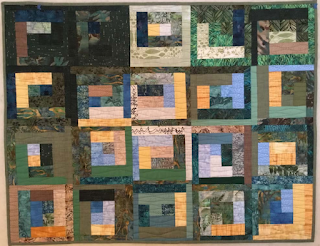
Terry Peckarsky - Take Me to the River
The colors in Caillebotte's Skiffs inspired Terry to
play with the analogous color scheme using Katie
Pasquini Masopust's Artful Log Cabin technique
for an abstract response to the painting.
Terry Peckarsky - Local Motion
Terry was fascinated by the texture of the water in
Caillebotte's Skiffs, so attempted to recreate the
artist's brushstrokes in small rectangles of fabric. Her photo of a single rower on the C&O canal
seemed to be right at home.
Terry Peckarsky - Let's Row
Upturned canoes at the lake near Terry's home seem
poised to get in the water. She altered the photo
before printing on fabric and quilted it tightly. She printed the words of a French folk song about
"mon petit joli bateau," or "my pretty little boat,"
as a reference to the French painter's Yerres
River. The wavy flanges and the three-dimensional pinwheels suggest the movement of
the water and the paddles of the oars on the
highly textured water.
Susan Price - Ripples
The cool blue-greens in Skiffs by Gustave
Caillebotte were Sue's inspiration for this
challenge. If you look at pieces displayed on her design wall, you’ll see that this is a color she uses a lot! For this challenge, she decided to try to
make an abstract version of the painting. Her goal was to convey a feeling of
tranquility reflecting the gentle ripples in the
water.
Bonnie Rhoby - Skiffs Texturized
Stepping out of her usual realistic work Bonnie wanted to
capture the texture of the painting and still relay to the
viewer the overall essence of the subject. She used various
styles of yarn that were either hand stitched or machine
stitched. Of course there had to be some needle turn
appliqué.
Barbara Sherwood - Lazy River
Barb was inspired by the gently flowing waters in the photo. She used the following materials: Cotton fabric and thread,
wool felt batting.
Barbara Wise - Floating
Elements of the piece that inspired Barbara are the colors blue,
green, grey, and yellow. Keeping within her signature style
but using geometric shapes, she tells an abstract story of
falling leaves on water. Background squares are painted,
rectangular tree is a monoprint, and square leaves are
fabric dyed with turmeric.
Here's a look at all the pieces together. As with our last challenge, it is a cohesive group, tied together by color, shape and movement. We did a great job, didn't we? It's always fun and interesting to see everyone's interpretation and how our individual styles interact with each other.
.


No comments:
Post a Comment