Wednesday, September 30, 2020

Quilt Camp-Week 11 Sometimes your creative journey takes you in a different direction

Last week, Sue wrote about how she revived her original idea for using our new screens in a project to benefit the Virginia Quilt Museum by adding variety to her 9 patch squares.

Elizabeth also tried to make a 9 patch but took the path of a quilt-as-you-go with a leaf quilt design.  Her plan was to fuse applique her fall inspired leaves to the block after the quilting and then stitch them around the edges.  What happened?  After making a few trial blocks she decided the leaves were too small for the blocks,   Also, the leaf designs, while lovely and some of our best selling screens, are not the new thermofax screens we hoped to showcase for you.  The bark screen was the intention for the 9 patch.  


After seeing Sue's dyed fabric, Elizabeth remembered this spiral ice dyed piece and it reminded her of the fall through the skylights here in her house in New Hampshire.


Taking the spiral as a whole piece, she laid out her fused leaves in a circular pattern and then still thought, nah, this isn't working.  That happens some times when making an art quilt and we have to give ourselves permission to put it aside and go create something else.


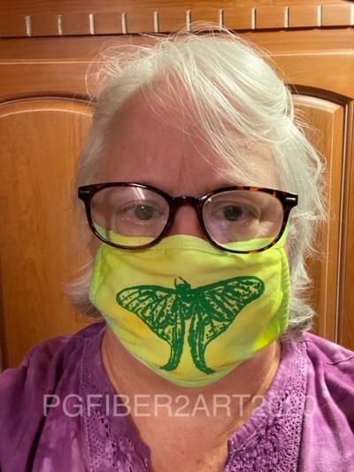
A few warm early fall days were arriving so she went back to ice dyeing some masks. Maybe she will return to the other ideas on another day?  On some lime green/yellow ice dyed combinations the new Luna Moth was printed with fabric paint.


One of our new screen options are words.  We will burn screens of your choice of words and you can use them in your fiber, paper, clay, or other surfaces that will take a paint or thickened dye.  Elizabeth made these masks using some screens she had on hand.  Wouldn't "smile" be a great one to use?  Smile is one of our new word screens.  Bloom seemed like a good choice also.


You can find the luna moth and word screens, as well as all our other designs, in our Etsy shop.  We are also happy to make custom screens from your images.  Don't forget our fall sale runs through Saturday, Oct. 3. Use code SEPT2020 at check out for a 15% discount.

Wednesday, September 23, 2020

Quilt Camp Week 10 - Colors of Fall

After 9 weeks of quilt camp posts, last week we took a much needed break.  We had a topic in mind but sometimes things don't work out as intended.  The extra time helped to take a step back and refocus on the project.  Our goal was to feature some of the new screens added to the Etsy shop.  Along with that, we were reminded of a challenge for fall quilts to be donated to the Virginia Quilt Museum, so we decided to combine the two ideas. The museum is asking for 15" square quilts in "Colors of Fall" to be sent in for display by October 19.  After display, they can be donated to the museum for sale in the gift shop. Sue chose to work with the bald cypress screen on 5" squares in a 9-patch pattern, and fall leaves (also screen prints).  Things started out pretty well, with 9 squares printed.


Sue used rusted fabric as the background and printed with Simply Screen paint by Plaid in "French roast".  (The Simply Screen paint appears to have been discontinued - an online search only found it available on eBay.)


Then she printed leaves on a multi-colored piece of fabric that had fall colors.


Fusible was added to the back and the leaves were cut out.  But the problem came when laying out the blocks and leaves; it was really blah, to put it mildly.  The leaves didn't stand out the way she thought they would, and there was too much brown. The first step to correct that was to add a brighter color behind the leaves.  If you enlarge the photo below, you can see that some of the leaves have a yellow or orange edge that was done by  fusing to another layer of fabric.


But even that wasn't enough. Still not very exciting, right?  So, what could she add to liven it up?  Here were 2 options.
This hand-dyed red seemed to add a nice spark.  Should it be a column down the center, or should she stick with the standard 9-patch format?
The 9-patch format won out.  Above are the 9 blocks sewn together.  As it worked out, some of the smaller leaves that didn't contrast well with the brown cypress print worked better on the red background.
So here is the finished piece.  The leaves are fused on, then free-motion stitched.  The background is also free-motion quilted with a meander stitch in clear nylon thread.   The cypress bark prints are a nice contrast with the red.  Much better than the original idea!  Now it is ready to be sent to the museum - we hope they like it!

If you would like to participate in the museum's Colors of Fall challenge, you can read about it here.

Wednesday, September 16, 2020

Quilt Camp Pause

This week we are taking a break from our quilt camp posts and want to share - for those who don't subscribe - that our latest newsletter was recently published and includes a discount code for 15% off on screens in the Etsy shop through October 3 with code SEPT2020.   If you aren't a subscriber you can access the newsletter here.  Better still, just to the right on this page, you can subscribe to our email list and then will receive our newsletters in your inbox. We promise not to inundate you with mail, our average is 3-4 newsletters a year. You can also follow the blog by email and get notices of new posts.  The newsletter debuts 3 new screens that were added to the Etsy shop, shown below.


Wednesday, September 9, 2020

Quilt Camp Week 9 - Fusible Applique with Thermofax Screens

 Another technique we have used Thermofax screen printing for is to create raw edge fusible appliques.   Back in May, Sue shared a project where she used the "lazy daisy" screen in 3 sizes to make appliques. They were printed with black acrylic paint on yellow fabric.

After printing and heat setting, they need to be backed with a fusible product before cutting out.  Sue used MistyFuse, but you could also use Wonder Under or Steam-a-Seam2 Lite, or another favorite fusible, as long as it is fairly thin.  You don't want to add stiffness or something that might gum up on your needle when stitching. After fusing, cut them out, then you are ready to create your arrangement on the background.  Play with the arrangement until you are satisfied.  Consideration was also given to where the stems and leaves would go and what needed to go underneath what. Above right is the arrangement with stems and leaves added.  The stems & leaves were fused and stitched before the flowers were fused in place. To maintain your arrangement, take a picture for reference and you can also lay them out on another surface the same way you want them on the quilt.


The flowers were all edge stitched in black along the printing lines, and the petals have some accent stitching in yellow.  

Elizabeth made her applique sample using a zebra screen and made it into a postcard.
She cut her postcard base (fusible Timtex or Peltex can be used) to the standard 4 x 6" size and printed the zebras on a yellow fabric.  Then she fused Heat 'n Bond to the back before cutting them out.
Above shows the cut out zebra and positioning it against the background of grasses printed on the fabric to be used.
Finished postcard above.


Here are some other examples of applique projects.
Butterfly postcards - printed butterflies, cut out after fusible applied, finished postcards.

Falling leaves - pin oak leaf appliques, before and after applied to quilt.

The birds were printed on a color catcher (colored by putting in with a wash load of dyed fabric); different colors were tested to see what looked best on the piece on the right.  Color catchers are great for this technique because they are non-woven and won't fray on the edges. 

We have a number of screens in the shop that work well for this fusible applique technique, including various flowers, leaves, bird, butterflies. If you have a photo of an item, you can turn it into a screen - all of those items mentioned started out as photos we took. And like the flowers, when they are digital, you can create various sizes.  What photos do you have that would make great appliques?

Wednesday, September 2, 2020

Quilt Camp Week 8 - Deconstructed Screen Printing

Have you ever tried a technique called Deconstructed Screen Printing?  It can also be called Breakdown Printing.   It has been a long time since we have done any but this week, we went back to try it again.

It takes a standard screen in a wooden frame.  These can be bought at the big box craft stores or online at art supply sources.  After taping the wood part of the frame, so it doesn't get wet and swell, you are ready to start your process.

We mixed dye with a product called print paste which is purchased from a dye house or art supply store.  Print paste is mixed with water to create a thick medium which is used to hold your dye in a viscose suspension instead of a watery one.  This can also be called thickened dye.  First you mix the print paste and then save out about a cup to add dye to.  You will use the remaining paste to squeegee across the screen later.  
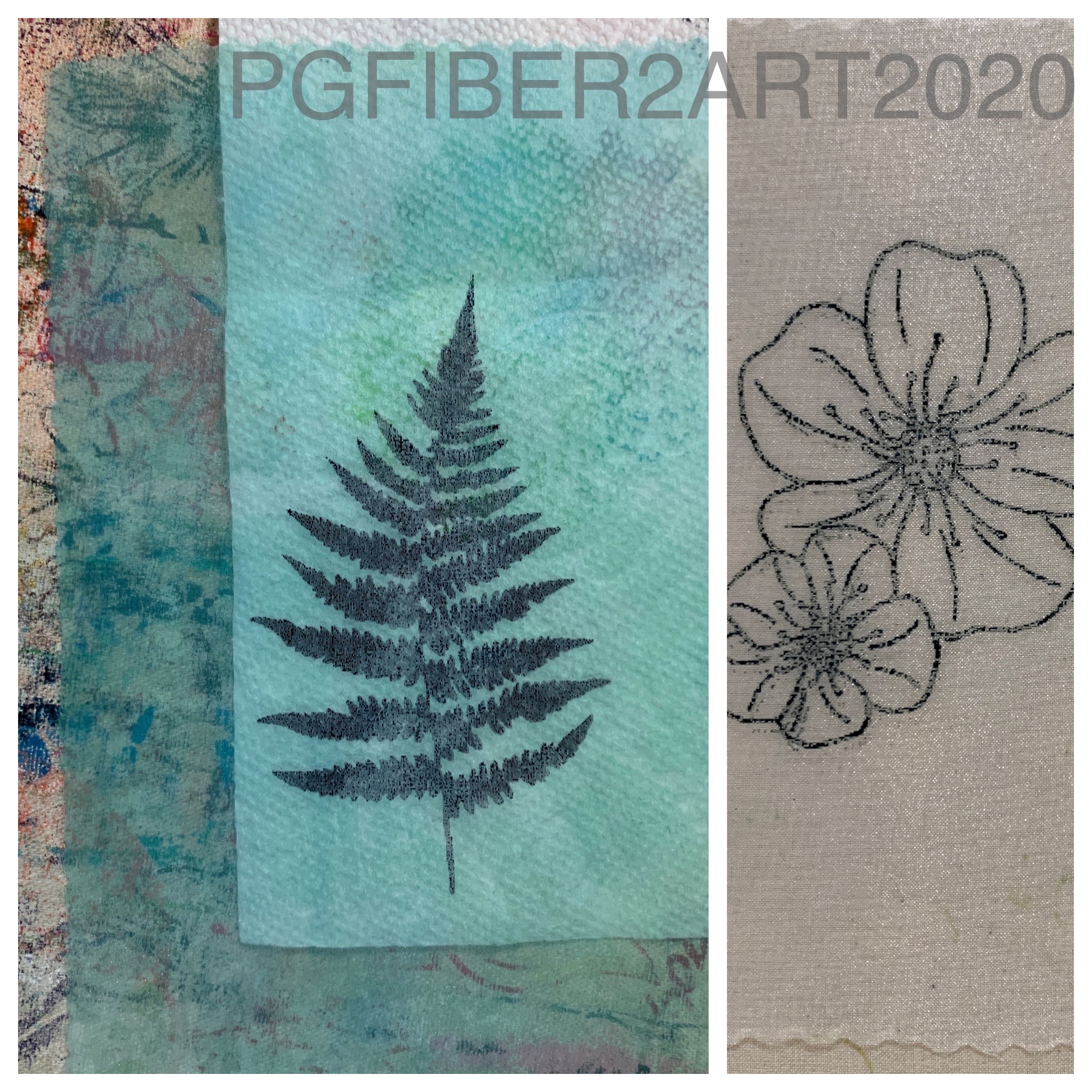
Into the saved cup of print paste went some dye powder and it was stirred well.  On the flat side of the screen, this dye mixture was spread evenly over the screen and laid paste side up over a rack sitting in a clean cat litter box.  Once the dye mixture is starting to set, you can add items of interest which will leave silhouette outlines when you pull your final prints.  We have used thick foam stamps in the past and this week tried with some shredded paper from the mechanical shredder.  No one is ever going to read those documents again!  When we used the foam stamps they went into the dye infused print paste when it was starting to set up and left until it was nearly or quite dry.  With the shredded paper the screen with the dye infused paste was completely dry because truthfully it has been sitting in the litter box for a LONG time!  Once your screen is ready, you can start the printing fun.  First though, soak your fabric in soda ash just as you would for tie dyeing or liquid dye techniques.  The fabric we used was old pieces of hand dye that wasn't very inspiring and needed something more.


For this piece the shredded paper was sprinkled over some previously dyed fabric and then the screen was placed dye side down on the top of the shredded paper and fabric.  Clear print paste was poured into the well of the screen and gently spread to cover the screen.  As this piece had set so long, it was very solid on the side next to the fabric, and the clear print paste was allowed to sit on the screen for a few minutes to soften the reverse side.  With a squeegee drawn over the print paste in the well, the negative space between the shredded paper was printed onto the fabric.  As you move the screen to cover the fabric you may want to rotate the orientation of the screen.  When the dye infused print paste is all used up or begins to get very light you are likely done.

After a few days of sitting so the dye could bond to the fabric, the piece was washed out and hung to dry.  It needs a good wash as the soda ash as well as the print paste will make it feel stiff.

This piece looks a lot better now than when it was just rainbow dye colors and now can be envisioned cut up in some other project.  What would you make with it?  

Wednesday, August 26, 2020

Quilt Camp Week 7 - Printing with Dye & Other Materials

This week we are combining printing with thickened dye along with printing on things other than cotton fabric.  What is thickened dye?  It is dye added to a clear print paste made with sodium alginate and water.  Exactly as the name implies, it thickens the dye to a consistency that works for printing.  Why would you want to print with dye instead of paint?  Dye bonds with the fibers and gives fabric a softer hand than paint.  It can also be discharged as we saw a few weeks ago.  Paint sits on the fabric surface, so adds a little bit of stiffness, depending on the brand of paint.

The ingredients for clear print paste include water, urea, and sodium alginate. Both urea and sodium alginate (thick SH), as well as dyes, are available at Pro Chemical and Dye.   Urea helps with the solubility of dyes.  Clear print paste will last for weeks in a cool environment.  For this example, Sue used 1 c hot water, 2 T urea, and 1 T sodium alginate.  Stir rapidly until as smooth as possible (it will be lumpy at first), then allow it to stand for at least 1 hour.  After standing it will become smoother.  For the actual printing, 2 tsp of dye were added to 1/4 cup of the clear paste.  Another ingredient needed for the dye to bond with the fabric is soda ash.  You can either pre-soak your fabric in a soda ash solution, or add it to the print paste.  For this amount of paste, a 1/4 tsp of soda ash was dissolved in hot water and then added to the print paste. This mixture needs to be used within 4 hours or the soda ash loses its effectiveness and the dye will not fully bond with the fibers.  The dye Sue used for her print paste was teal, though in the photos that follow it almost looks black.

Here are some of the prints she made.  The first 2 were printed over geli plate printed backgrounds.
This is our chain link screen.
This is the Merrymount wildflower.  As with other products we've used, the printing process is the same as with paint.
These 2 prints are on a background made with a process called breakdown printing.  We'll have another post on that process later.
More prints on pieces of cotton that were first painted with diluted textile paint. Now for some other materials.
 
We enjoy printing on Color Catchers.  If you're not familiar with them, Color Catchers are a product you can buy in the laundry section of your local store.   You put them in with laundry to absorb excess dyes; in our case, we use them when washing hand dyed fabric and end up with some pretty colors.  Why print on these?  Well, they are a non-woven product similar to interfacing and do not ravel.  That makes them good for raw edge appliques and use in multi media work, journaling, etc.
Another fabric you can print on is organza; this piece was first painted along with the others above. A plain white piece is shown on the right.  This would be good for layering.
And finally, another product that can be painted and printed on is Lutrador.  This is another non-woven product (polyester) that can be used in art quilts or mixed media work.  You can see the texture in the photo on the right.

Don't forget you can print on paper too, and silk fabric is another choice. It is especially good for silk to keep the soft hand and drape of the fabric (think silk scarves).  What will you print with thickened dyes?  Finally, a bit of advice from Elizabeth: don't let your printed pieces and dye paste sit outside and then leave.  If it rains like it did for her, you may end up with a gooey mess!

Wednesday, August 19, 2020

Quilt Camp Week 6 - Multiple Colors

The techniques we've shown so far for using Thermofax screens have mostly been one color techniques.  You may be wondering - how do they print t-shirts and other products with multiple colors?  While the commercial process is a bit different from Thermofax screens, there are ways to use multiple colors with screens, and that is our topic for this 6th week of quilt camp. We'll look at ways of blending colors and designs that use more than one screen.  So let's get started.

One way to use multiple colors in a design is to create images with multiple parts - for example, an image that has both "fill" and outline, or one that has both a positive and negative component as the following pictures will show.

This is a 2 part screen for a black-eyed Susan - one screen for the petals and one screen for the center and outline. Print the petals first and allow to dry, so the outline will print on top. Sue's print is above, Elizabeth's is below.
Elizabeth is printing on a background created with breakdown printing, another printing process we'll talk about in a later post.  Her tips are to print off the edge, and don't worry about getting a perfect match when you do a 2-screen print like this.

Here's another flower, this time there's a rectangular outline which creates the negative image (empty space) and then a second screen for the flower itself (positive image).
Above, the positive image is printed over the negative.
These are Sue's finished prints. Hmm...how did those pink flowers end up yellow?  Short answer, she didn't like the original color combination so did another! The yellow center on the right print was added with a paint brush.

You can also use multiple colors on the same screen that will blend as you print, and change slightly with every succeeding print.
Here Sue used yellow and red for some leaf prints.  You'll get the most distinction between colors on the first print.  After that, they will blend as you print to form new colors. So carefully consider your color choices.
Can you tell which is the first print from the paint photo above?

Elizabeth printed a zebra with two colors - gold from Artistic Artifacts at the top and navy blue from Pro-Chem at the bottom.  Her background here is also a breakdown print.

Another way of incorporating multiple colors in a print is by using water soluble crayons like those shown below - Derwent Inktense color blocks and Reeves Water Soluble Wax Pastels.
For this process, start with the screen placed on top of parchment paper (freezer paper would work too).  Apply the color to the screen just by coloring over it. Then place your screen on the fabric you wish to print on.
Matte medium is the product needed to make the print.  Place a line of the medium across the top of the screen and squeegee across it the same as you would with paint.  The medium dissolves the color and prints it through the screen onto the fabric.
The print on the left is done with the Inktense blocks, the fish on the right are done with the Reeves water soluble pastels.  The use of the matte medium adds a little bit of stiffness to these prints, but heat setting with the iron removes most of it.  This method gives you more control over the color placement.  The colors will blend a bit where they overlap, but not as much as using multiple paint colors.

Have fun trying these methods and products to add multiple colors to your prints.  If you see screens you like in this series of posts, look for them in our Etsy shop.  If you don't find them there, feel free to send us an email at pgfiber2art@gmail.com and let us know what you are interested in; we only have about half of our screen catalog in the Etsy shop, but are happy to add upon request.