Monday, July 17, 2023

Cyanotype Experiments on Coffee Filters

Update 7/17/2023. This is a repost from 2 years ago that gives you some background on cyanotype printing and experiments we did with prints on coffee filters to alter the outcomes. It's a fun way to experiment without a big investment in supplies.  Note that coffee filters are made of a substance that works well in mixed media projects and can be stitched on.  If it can stand up to hot water, it's pretty sturdy stuff!

For several years at Quilt Camps, Sue and Elizabeth have experimented with Cyanotype on fabric.  The availability of ferns and other interesting botanicals in New Hampshire make them fun to do.  Of course, we also have made some at our homes in Virginia and Elizabeth has done some in the hot humid weather in Mississippi. Heat and humidity certainly affect the results as does the directness of the sun on any given day and if the sky is cloudy.  So many variables and it is the serendipity that makes it interesting.

Cyanotype is actually an alternative photography process developed in 1842 by English Astronomer, John Herschel who was interested in ways to copy his manuscripts and notes.  It was Anna Atkins who in 1843 used the process to catalog botanical specimens.  

In preparation for a paper collage workshop in a few weeks, Elizabeth has been experimenting with some cyanotypes while still in New Hampshire where it certainly isn't hot or humid and the sun seems to get weaker every day.  Even so, experimenting is fun and helps to build up a supply of papers from which to choose when the workshop begins.

Round coffee filters are an easy way to experiment.  They are quick to dry after applying the chemicals to the paper and you can treat many of them at once.

Following some instruction from the dharma website about Jacquard products (Jacquard is the company that makes the chemicals needed for cyanotype) she started bleaching and toning some of the exposed samples to see what the results might be.

Only a Soda Ash rinse for this one, you can see how it really bleaches out the cyanotype chemicals.


Here are some rinsed with Borax then with Soda Ash water and a final rinse in plain water,  Here she got a bonus print.  Coffee filters are very thin and she hadn't noticed that two were stuck together until they separated during the final rinse.   The lower filter was the one on the bottom.


This one was rinsed with Borax followed by Soda Ash and then a Hydrogen Peroxide rinse.  The hydrogen peroxide brings out more of the blue as it speeds up the development process.


This piece was rinsed in Soda Ash which bleached it out and then followed by Borax.  The brown streak in the middle is explained below.


These were swished in Borax, then a mix of Hydrogen Peroxide and water, followed by a dip in soda ash and another rinse in Hydrogen Peroxide and water.  Her scientific methods aren't quite as firm as they should be as measuring was loosey goosey, but approximately 1 part Borax to two parts water, 1/4 cup of soda ash to 1 gallon of water, and a glugg of hydrogen peroxide in a cat litter pan full of water.  Surely, on different days with different amounts of chemicals, different temperatures, different types of treated papers, results will vary a lot.


The brown streaks on the prints above came from hanging them over a drying rack.  Previously a tee-shirt which had been soaked in soda ash had been hanging on the rack and the residual soda ash bleached out the streaks in these two pieces.

There are other toners and bleach you can also use.  Let us know if you have done any experiments with cyanotype.

Sunday, July 9, 2023

Screen Printing with League of NH Craftsmen

Elizabeth and her sister, Becky, took a class at the Center Sandwich League of NH Craftsmen shop last week and learned a lot about screen printing an image.  The League is a group of juried artists who sell in dedicated shops all over the state.  Their work is beautiful and of the highest quality.  Our class was with  Master Printmaker, William Mitchell who was also a master teacher.  Please check out his website at the link and take a look at his beautiful prints.

Bill introduced us to the screen and drew his design directly on the polyester sheer fabric with a dull pencil.
He had each class member draw a block on his demonstration screen, then we filled it in with the screen drawing fluid using a small paintbrush.  This would be the design we would see when printed.
Once drawn he advised us to hold the screen up to the light to be sure the design was filled completely as any areas that might be too thin wouldn't make for a good result.
Next we learned how to squeegee on the screen filler which would block out all the background areas. He used a piece of cardstock as his squeegee for this part of the process, instead of the large rubber squeegee.
Here is the demonstration screen with the blue areas being the design and the red areas the background where no paint should go through the screen.
Elizabeth's sister, Becky, decided to draw a variation of a Zentangle design she once did. It is reminiscent of a fern unfurling. 
Elizabeth drew a modernized version of a flower.
Once each step was dry, Bill showed us how to remove the blue ink, leaving only the red ink in the screen.  Remember that where the blue ink was is going to be the print.

Bill had a great clothesline for hanging pieces without having them touch each other.  Straws on the line kept the paper from touching as the clothespins were evenly spaced.

These are Becky's designs after being screened on paper and hung on the line to dry.  This class was a one color process but we hope to take a class in the future where we could learn to make images with more than one color.


This is the final print that Becky made.


This is the final print from Elizabeth's screen.  It is printed on Pacon 80 weight paper from Staples.


Monday, July 3, 2023

Blue Ridge Heron

The SAQA Regional Group of North Carolina and Virginia has mounted a new exhibit called Reflections that will debut at the Petersburg Area Art League in Virginia on July 7 and remain through August 5.  These quilts depict the rich and diverse worlds of Virginia and North Carolina including colors, shapes, textures, natural environments, structures and cultures.  Sue created her Blue Ridge Heron (18" square) for this exhibit.

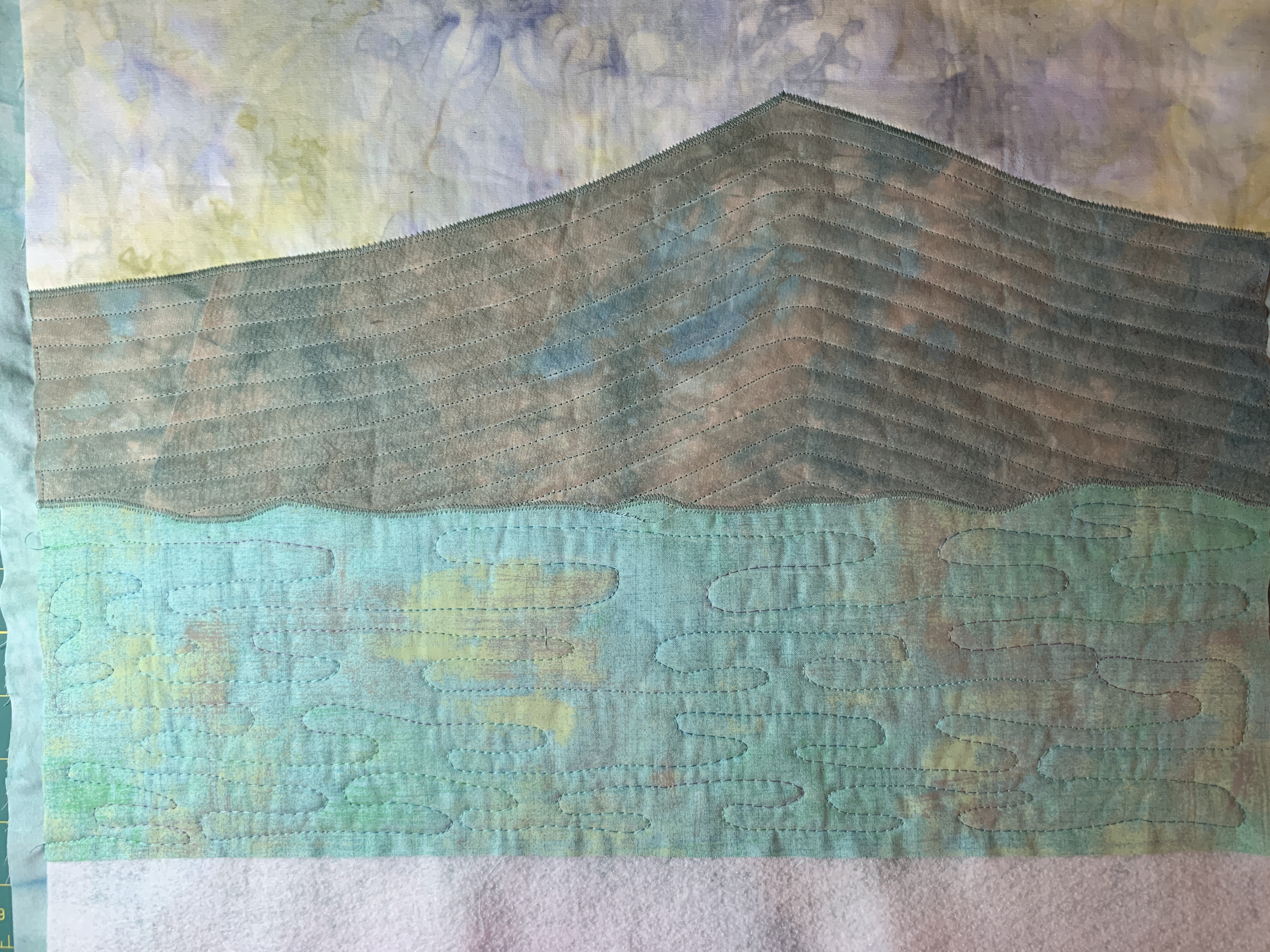
The basis for this quilt is two photos that were taken at Peaks of Otter Lodge along the Blue Ridge Parkway in southern Virginia. The 2 photos were blended with an app called Image Blender to create the pattern for the quilt.


Sue started by building and quilting the background on a foundation of fusible fleece which serves as the batting.  Simple shapes and quilting were enhanced by fabric selection.  The mountain has a layer of organza fused on top to mute the colors. 


Next, the heron was added by fusing and then doing a machine satin stitch around the edges.


The next step was adding the grass and tree shape on the left.  The grass was created from a piece of shibori fabric made by Vicki Welsh of Colorways by Vicki.  (See second photo below.)  Vicki featured this quilt on her blog on July 2.


Sue started with a strip of the fabric, applied a fusible product to the back, then began cutting away the lighter parts to create the grass effect.


You can see this and the other wonderful quilts in the exhibit at Petersburg Area Art League beginning July 7.  Other venues will be announced when they are known.  

Monday, June 26, 2023

SAQA Benefit Auction

Each fall, Studio Art Quilt Associates (SAQA) holds an art quilt auction as its main fund-raising event. Proceeds support exhibitions, publications, and educational outreach. Twelve-inch square quilts are made and donated by members and then auctioned in an online event over a period of 3 weeks in September/October.  Sue recently completed and sent in her donation.

"Filtered" was made from scraps of shibori/indigo and rusted fabrics along with a cyanotype printed on a flattened coffee filter.  Both hand and machine stitching were used to quilt and embellish.


Here is the background prior to adding the cyanotype where you can see the various fabrics used, all leftovers from previous projects.


Portions were quilted with straight line machine stitching.  Other parts were enhanced with hand stitching.


Above you can see some of the hand stitched circles and a row of fly stitches across the bottom. You can also see the machine stitching that outlines the cyanotype print and a blanket stitch used around the edge.


Here is the backing with corner triangles for hanging, or alternatively a ribbon loop in the center.


And the finished piece.  Watch this blog and our other social media for notice when the auction takes place this fall.  Bidding is open to anyone.  There are always many fabulous pieces of quilt art available.

Monday, June 19, 2023

Thermofax Screen Printing Tips

Previously posted in July 2020, worth repeating as a reminder of best practices.

We frequently get various questions about printing from customers in our Etsy shop.  Though we have FAQs on Etsy and this blog, people don't always read them.  So we thought it might be helpful to do a post of our printing tips.  There are always variables when printing, so we recommend doing test prints before starting on your project.  That way you can work out any issues without ruining the project.

First things first:
TAPE YOUR SCREEN if you did not order a pre-taped screen. See the tutorial on our blog at http://pgfiber2art.blogspot.com/p/blog-page_10.html
Find a how to print tutorial at http://pgfiber2art.blogspot.com/2014/10/how-to-print-with-thermofax-screens.html


Printing Tips:

  • Thermofax printing works best on a padded surface.  On a flat surface, we use a piece of craft felt topped with a piece of canvas fabric or muslin.  The fabric serves to absorb excess paint.  (top picture below) For t-shirts, other garments, or tote bags place a piece of cardboard covered in waste fabric inside to provide cushioning and prevent paint transfer if it bleeds through; change fabric as needed; or just use a couple of layers of craft felt.  (bottom picture below)

  • If you are printing on fabrics, use paints formulated for textiles.  These paints will give your finished product a softer “hand”. Some types of paint we use include: Fluid Textile Paint (artisticartifacts.com), ProChem (prochemicalanddye.com), Speedball Fabric Printing Inks, Jacquard paints, Versatex paints (DharmaTrading.com). You can also find paint at DickBlick.com and jerrysartarama.com. 

  • Different paints have different viscosity; some sink into the fabric more than others. In the photo below, the white paint was thinner and sank in more and gave a raised effect to the lettering.  The blue paint was thicker and stayed on the surface keeping it flatter.
     
  • If printing on paper, you can use acrylic craft paints. Speedball makes both textile and non-textile inks (paints). Look for the “fabric” designation when printing textiles. 
  • DO A TEST PRINT.  Before tackling your project, do a test print so you know how many passes you need, how much pressure with the squeegee, and can see any spots that may need a bit more attention or may not print clearly.  Often the screen needs to be “primed” and will print better on the 2nd or 3rd print.  Below, the top picture shows the print after one pass with the squeegee. The bottom shows the same print after about 4 passes.  Keep lifting edges of the screen to check the print before removing the screen.
  • Squeegees come in all types and sizes.  While a general rule of thumb is to match the size of the squeegee to the size of the print, you may not get even pressure with a large squeegee.  Our favorite squeegees to use are old credit cards and hotel keys. There are also scrapers that come in sets of 3 sizes that you can find in auto supply stores (used for detailing) or big box home stores in the paint department. If you want something larger you can find them at the art supply websites. When printing, hold the squeegee at a 90 degree angle and pull across the screen towards yourself.
  • We do not usually secure the screen to the surface we are printing on, but if you need to, blue painters tape works well for that.  Otherwise, hold the taped edges of the screen securely while printing.
  •  IMPORTANT! Before removing the screen, pick up the edges and check the print to see if you need to go over any area again.  You can carefully move your hand holding the screen to different spots to check so that the screen does not shift.  Or use tape to hold the screen in place. As stated previously, one pass across the screen is seldom enough.
  • Put a line of paint across the top of the screen and pull the paint toward you.  Moving the squeegee in different directions means you are likely to shift the screen and end up with a shadow print. It is Ok to put more paint in denser areas. You are pulling the paint all the way across the screen so it may take more than you think. Dense/solid areas will require more paint and passes of the squeegee.  A smaller squeegee means you can target specific areas more easily.
  •  Heat set (iron) the print when dry.


Clean Up:


·        As soon as you finish with a screen, drop it into a pan of room temperature water to prevent paint from drying on the screen. Paints labeled "pearlescent" that contain mica will clog a screen more quickly than those without and will need to be cleaned sooner.
·        Use an old toothbrush or fingernail brush to gently clean the screen; some paints may leave a slight stain.
·        Pat the screen dry with an old bath towel and allow to dry completely before storing.  Screens put away damp may stick to each other and cause the plastic emulsion to peel off.

We hope these tips will lead to more successful printing!

Monday, June 12, 2023

Fusible Applique Process

This is a re-post of a blog post from September 2020 on the fusible applique process we use with Thermofax printing.  This is the same process described in the "Thermofax Printing for Fusible Applique" article published in the summer 2023 issue of Quilting Arts magazine.  The issue is currently available digitally online and on newsstand June 13.  We have a number of screen designs suitable for this process available in our Etsy shop.  Feel free to contact us with any questions. (pgfiber2art@gmail.com)


Another technique we have used Thermofax screen printing for is to create raw edge fusible appliques.  Back in May, Sue shared a project where she used the "lazy daisy" screen in 3 sizes to make appliques. They were printed with black acrylic paint on yellow fabric.

After printing and heat setting, they need to be backed with a fusible product before cutting out.  Sue used MistyFuse, but you could also use Wonder Under or Steam-a-Seam2 Lite, or another favorite fusible, as long as it is fairly thin.  You don't want to add stiffness or something that might gum up on your needle when stitching. After fusing, cut them out, then you are ready to create your arrangement on the background.  Play with the arrangement until you are satisfied.  Consideration was also given to where the stems and leaves would go and what needed to go underneath what. Above right is the arrangement with stems and leaves added.  The stems & leaves were fused and stitched before the flowers were fused in place. To maintain your arrangement, take a picture for reference and you can also lay them out on another surface the same way you want them on the quilt.


The flowers were all edge stitched in black along the printing lines, and the petals have some accent stitching in yellow.  

Elizabeth made her applique sample using a zebra screen and made it into a postcard.
She cut her postcard base (fusible Timtex or Peltex can be used) to the standard 4 x 6" size and printed the zebras on a yellow fabric.  Then she fused Heat 'n Bond to the back before cutting them out.
Above shows the cut out zebra and positioning it against the background of grasses printed on the fabric to be used.
Finished postcard above.


Here are some other examples of applique projects.
Butterfly postcards - printed butterflies, cut out after fusible applied, finished postcards.

Falling leaves - pin oak leaf appliques, before and after applied to quilt.

The birds were printed on a color catcher (colored by putting in with a wash load of dyed fabric); different colors were tested to see what looked best on the piece on the right.  Color catchers are great for this technique because they are non-woven and won't fray on the edges. 

We have a number of screens in the shop that work well for this fusible applique technique, including various flowers, leaves, bird, butterflies. If you have a photo of an item, you can turn it into a screen - all of those items mentioned started out as photos we took. And like the flowers, when they are digital, you can create various sizes.  What photos do you have that would make great appliques?

Monday, June 5, 2023

Published!


One of Sue's bucket list items was to publish an article in Quilting Arts magazine, and she accomplished that goal with the summer 2023 issue of Quilting Arts, available now in digital format or on newsstands June 13.  Subscription copies will arrive in mailboxes by the 13th.  The article illustrates her process for using Thermofax prints to create fusible appliques.  While the idea for this article floated around in her head for a while, when finally submitted, she was pleasantly surprised to find it quickly accepted.

Without giving too much away (pick up a copy of the magazine!), it features the coneflower quilt below.  This full-size photo of the quilt does not actually appear in the issue - just smaller, partial images and step-outs.  


The issue also features a cover contest.  There were 161 entries for the contest which were winnowed down to 7 finalists before choosing Kate Themel's "As You Set Out" quilt below.

There are intriguing articles in this issue - can't wait to sit down with the paper copy when it arrives!  If you have any questions about the article or process, contact us at pgfiber2art@gmail.com.